

7 Best Data Visualization Tools for Clearer Insights
Writer & Blogger
Rahul Goswami
Share
Published on
Read Time
Approx 8 min
Data visualization tools help businesses turn complex datasets into charts, graphs, dashboards, and interactive reports that are easier to understand. Instead of reviewing large spreadsheets or rows of numbers, teams can use visualizations to identify trends, compare performance, spot unusual changes, and communicate important findings more effectively.
Modern data visualization software supports a wide range of use cases, from business intelligence and financial reporting to marketing analytics, sales performance, operations, and executive dashboards. Many platforms also connect directly with databases, spreadsheets, cloud applications, and business systems, allowing teams to work with regularly updated information.
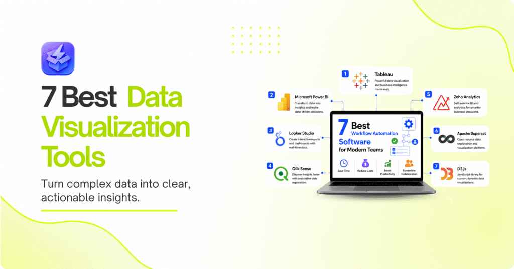
The best data visualization tool depends on the user’s technical expertise, data sources, reporting requirements, and budget. Tableau is a strong choice for advanced business analytics, Microsoft Power BI works particularly well for organizations using Microsoft’s ecosystem, Looker Studio is useful for accessible web-based reporting, Qlik Sense provides powerful associative analytics, and Zoho Analytics offers an approachable business intelligence experience. Apache Superset is an attractive option for teams seeking an open-source platform, while D3.js gives developers extensive control over custom visualizations.
In this guide, we’ll compare the best data visualization tools based on visualization capabilities, dashboards, data connections, customization, ease of use, analytics, and overall value.
Best Data Visualization Tools Compared
| Tool | Best For | Main Strength |
|---|---|---|
| Tableau | Advanced analytics | Powerful visual analytics |
| Microsoft Power BI | Business intelligence | Microsoft ecosystem integration |
| Looker Studio | Web-based reporting | Easy dashboard creation |
| Qlik Sense | Data exploration | Associative analytics |
| Zoho Analytics | Small and growing businesses | Accessible BI features |
| Apache Superset | Open-source analytics | Flexible self-hosted visualization |
| D3.js | Developers | Highly customized visualizations |
1. Tableau Is a Strong Choice for Advanced Data Visualization
Tableau is one of the most established platforms for business data visualization and analytics. It allows users to connect data from different sources and turn it into interactive charts, dashboards, and reports.
The platform is designed for users who need more than basic charts. Analysts can explore datasets, combine different visualizations, apply filters, and create dashboards that allow business users to interact with information.
Tableau can be used across departments, including finance, sales, marketing, operations, and management. Executives can use dashboards for high-level reporting, while analysts can explore data at a more detailed level.
Its extensive visualization capabilities make Tableau particularly useful when an organization needs to communicate complicated datasets in a visually understandable format.
Key Features
- Interactive dashboards
- Multiple visualization types
- Data blending
- Filters and drill-downs
- Business intelligence capabilities
- Data exploration
- Dashboard sharing
- Connections to multiple data sources
Pros and Cons
Pros
- Powerful visualization capabilities
- Strong interactive dashboards
- Suitable for complex analytics
- Supports many data sources
- Useful for enterprise reporting
Cons
- Can require time to learn
- Advanced functionality may be more than small teams need
- Complex dashboards can require careful design
Tableau is best suited to organizations that want sophisticated data visualization and have users who are willing to invest time in learning the platform.
2. Microsoft Power BI Simplifies Business Intelligence
Microsoft Power BI combines data visualization, reporting, and business intelligence in a platform that is particularly attractive to organizations already using Microsoft products.
Users can connect data from spreadsheets, databases, cloud services, and other sources before creating interactive reports and dashboards. Visualizations can help teams understand sales, financial performance, customer activity, operational metrics, and other business information.
One of Power BI’s biggest advantages is its integration with the wider Microsoft ecosystem. Organizations already using Excel, Microsoft 365, Azure, or other Microsoft technologies may find it easier to incorporate Power BI into existing workflows.
The platform supports both simple reporting and more advanced analytical use cases, making it suitable for different levels of users.
Key Features
- Interactive dashboards
- Data modeling
- Business intelligence reports
- Multiple data connectors
- Microsoft ecosystem integration
- Data filtering
- Report sharing
- Automated data refresh capabilities
Pros and Cons
Pros
- Strong business intelligence features
- Excellent Microsoft integration
- Wide range of visualization options
- Suitable for organizations of different sizes
- Works well with existing Microsoft workflows
Cons
- Advanced functionality can require technical knowledge
- Data models may become complicated as projects grow
- Beginners may need time to understand the platform
Power BI is a strong choice for businesses that want visualization and business intelligence capabilities within a familiar Microsoft environment.
3. Looker Studio Makes Web-Based Reporting Accessible
Looker Studio is designed to make interactive reporting and dashboard creation accessible to a broad range of users. Its web-based approach makes it useful for teams that need to create and share reports without deploying complex visualization infrastructure.
The platform can be particularly useful for marketing and digital analytics teams that need to bring information from different sources into a single dashboard. Users can create charts, tables, scorecards, and other visual elements and arrange them into interactive reports.
Its relatively approachable interface makes it suitable for users who may not have extensive data science or business intelligence experience.
Key Features
- Interactive dashboards
- Web-based reporting
- Multiple chart types
- Data connectors
- Filters and controls
- Report sharing
- Collaborative reporting
Pros and Cons
Pros
- Accessible interface
- Convenient web-based workflow
- Useful for marketing reporting
- Easy dashboard sharing
- Suitable for recurring reports
Cons
- Advanced analytics capabilities are more limited than specialized BI platforms
- Complex reporting can require careful data preparation
- Capabilities depend partly on connected data sources
Looker Studio is a good option for teams that need straightforward, shareable dashboards without the complexity of a large enterprise analytics platform.
4. Qlik Sense Helps Teams Explore Data Interactively
Qlik Sense focuses on interactive data exploration and business intelligence. Its approach allows users to investigate relationships within datasets instead of simply viewing predefined reports.
This can be valuable when analysts need to explore information from different perspectives. Users can interact with visualizations, filter data, and investigate patterns that may not be obvious in static reports.
Qlik Sense can support business users as well as analysts, making it useful for organizations that want to encourage data-driven decision-making across departments.
The platform can be used for sales analysis, financial reporting, supply chain monitoring, operational analytics, and other business intelligence applications.
Key Features
- Interactive dashboards
- Data exploration
- Associative analytics
- Data integration
- Interactive filtering
- Business intelligence
- Reporting and visualization
Pros and Cons
Pros
- Strong interactive analysis
- Useful for exploring relationships in data
- Supports multiple business use cases
- Suitable for analytical teams
- Interactive dashboards
Cons
- Can require training for advanced use
- Complex implementations may require technical expertise
- May be more functionality than smaller teams need
Qlik Sense is particularly useful for organizations that want users to explore data interactively instead of relying only on predefined reports.
5. Zoho Analytics Is Good for Growing Businesses
Zoho Analytics provides business intelligence and data visualization features in a relatively approachable environment. It can help organizations bring data from different business systems into dashboards and reports.
The platform is useful for teams that need to monitor sales, marketing, finance, operations, and other business metrics without adopting an overly complex analytics environment.
Users can create visual reports and dashboards and use them to communicate performance across teams. This makes Zoho Analytics particularly appealing to small and growing businesses that need more advanced reporting as their data requirements increase.
Key Features
- Interactive dashboards
- Business reports
- Data connectors
- Charts and visualizations
- Automated reporting
- Data analysis
- Collaboration features
Pros and Cons
Pros
- Accessible for business users
- Suitable for multiple departments
- Supports different data sources
- Useful reporting capabilities
- Good option for growing teams
Cons
- Advanced requirements may call for more specialized BI platforms
- Complex data environments may require additional setup
- Highly customized analytics can require more expertise
Zoho Analytics is a practical choice for businesses looking for visualization and business intelligence without immediately moving to a highly specialized enterprise analytics platform.
6. Apache Superset Provides Open-Source Visualization
Apache Superset is an open-source data visualization and business intelligence platform. It allows organizations to build dashboards and explore data through a browser-based interface.
Its open-source nature makes it particularly interesting for technical teams that want greater control over their analytics environment. Organizations can deploy and customize the platform according to their infrastructure and requirements.
Superset supports a variety of visualization types and can work with different data sources. It can therefore serve as a flexible analytics layer for organizations with technical resources.
However, the flexibility of an open-source platform also means that implementation, maintenance, security, and infrastructure responsibilities may fall more heavily on the organization.
Key Features
- Open-source platform
- Interactive dashboards
- SQL-based analysis
- Multiple visualization types
- Database connectivity
- Browser-based analytics
- Self-hosting flexibility
Pros and Cons
Pros
- Open-source
- Flexible deployment
- Strong visualization capabilities
- Suitable for technical teams
- Greater control over infrastructure
Cons
- Requires technical expertise
- Self-hosting adds administrative responsibilities
- Not as beginner-friendly as simpler cloud platforms
Apache Superset is best suited to organizations with technical teams that want an open-source visualization platform and greater control over their analytics environment.
7. D3.js Gives Developers Complete Visualization Control
D3.js takes a different approach from traditional dashboard platforms. Instead of providing a ready-made business intelligence environment, it gives developers a JavaScript-based framework for creating highly customized data visualizations.
Developers can use D3.js to build charts, interactive graphics, maps, animations, and other visual experiences directly into web applications. This makes it particularly useful when standard dashboard software cannot provide the exact visual design or interaction a project requires.
Because D3.js offers significant control, it is commonly used when customization is more important than ease of use. However, it requires programming knowledge and is not intended to be a simple drag-and-drop reporting solution.
Key Features
- Custom data visualizations
- Interactive graphics
- JavaScript integration
- Web-based visualizations
- Custom animations
- Dynamic data binding
- Extensive design control
Pros and Cons
Pros
- Extremely flexible
- Highly customizable
- Excellent for web applications
- Supports advanced interactive graphics
- Full developer control
Cons
- Requires programming knowledge
- More development effort than dashboard platforms
- Not designed for nontechnical business users
D3.js is the strongest option on this list for developers who need complete control over how data is displayed and interacted with on the web.
How to Choose the Best Data Visualization Tool
The right data visualization tool depends on your data sources, users, technical expertise, reporting requirements, and desired level of customization.
If your organization needs advanced business analytics, Tableau or Power BI may be appropriate. Teams that need simple online dashboards can consider Looker Studio, while businesses looking for accessible business intelligence may benefit from Zoho Analytics.
Technical organizations may prefer Apache Superset for its open-source flexibility, while developers building custom web experiences can use D3.js.
Compare Visualization and Analytics Features
Before choosing a platform, consider:
- Dashboard capabilities
- Chart and visualization options
- Interactive filtering
- Data exploration
- Data connectors
- Reporting
- Data refresh
- Sharing and collaboration
- Customization
- Automation
A tool should make information easier to understand rather than simply adding more visual elements. Good visualization depends on choosing the right chart, presenting information clearly, and making important patterns easy to identify.
Consider Your Team’s Technical Skills
Technical expertise is another major consideration. Platforms such as Looker Studio can be approachable for business users, while Tableau, Power BI, and Qlik Sense can support more advanced analytical workflows.
Apache Superset and D3.js require more technical involvement. They can provide greater flexibility, but organizations need people who understand data, databases, development, or infrastructure.
It is also important to consider how the tool will fit into your existing technology stack. Check whether it connects with your databases, spreadsheets, cloud applications, CRM, marketing platforms, or other sources your team already uses.
Final Thought
The best data visualization tools make complex information easier to understand and turn raw data into useful business insights. Tableau is a strong choice for advanced visual analytics, while Microsoft Power BI is particularly attractive to organizations already using Microsoft’s ecosystem.
Looker Studio is useful for accessible web-based reporting, Qlik Sense supports interactive data exploration, and Zoho Analytics provides approachable business intelligence for growing organizations. Apache Superset gives technical teams an open-source alternative, while D3.js provides developers with extensive control over custom web visualizations.
There is no single best tool for every organization. The right choice depends on the complexity of your data, the people who will use the platform, the types of reports you need, and how much customization you require.
Before committing to a platform, test it with a real dataset and build a dashboard that your team would actually use. Pay attention to data connections, visualization quality, dashboard performance, ease of sharing, and how quickly users can turn information into actionable insights.
FAQ
What is a data visualization tool?
A data visualization tool is software that converts data into visual formats such as charts, graphs, dashboards, maps, and interactive reports. These visual formats make trends, relationships, and patterns easier to understand.
Which data visualization tool is best?
The best option depends on your requirements. Tableau and Power BI are strong choices for business intelligence, Looker Studio is useful for accessible online reporting, and D3.js is ideal for developers who need highly customized visualizations.
Is Power BI better than Tableau?
Neither is universally better. Power BI can be particularly attractive to organizations using Microsoft products, while Tableau is well known for its advanced visualization and analytical capabilities.
What is the easiest data visualization tool to use?
Ease of use depends on the user’s experience and requirements. Looker Studio and other business-focused dashboard tools can be approachable for beginners, while more advanced platforms may require additional training.
Can data visualization tools connect to databases?
Yes. Many data visualization and business intelligence platforms can connect to databases, spreadsheets, cloud services, and other data sources. The specific connectors available depend on the platform.
Is D3.js a data visualization tool?
Yes. D3.js is a JavaScript library used to create custom and interactive data visualizations for web applications. Unlike traditional dashboard platforms, it requires development skills and provides much greater control over the final visualization.